Add UI elements
This page describes the elements available to the Integration UI component and how to work with them.
Basic elements
To add basic elements to your UI, use the following methods of the route class:
| Method | Preview |
|---|---|
addText() addLink() addButton() |  |
addAlert() | 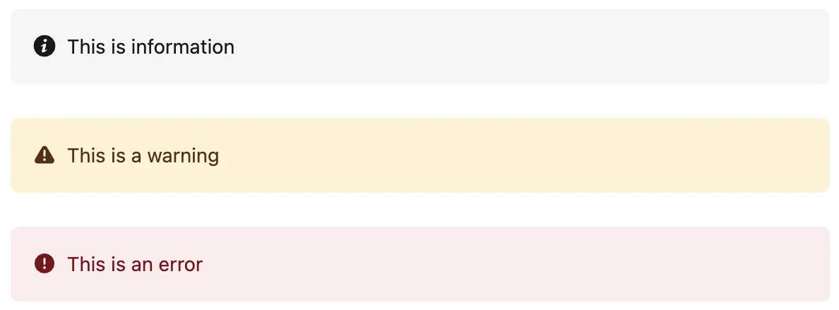 |
route.addText({  value: "Welcome to the ABC integration",});
route.addLink({  href: "https://mysitename.netlify.app",  text: "Learn more about this integration",});
route.addButton({  title: "Save Changes",  id: "saveChanges",  callback: () => console.log("Button selected!"),  confirmationMessage:    "Add this property to open a confirmation modal, before the callback is executed",});
// Supported alert levels include `info`, `warning`, and `error`route.addAlert({  level: "error",  text: "There was an error with your integration",});
Parent elements
Parent elements can render children within themselves. To add parent elements to your UI, use the following methods of the route class:
| Method | Preview |
|---|---|
addSection() | 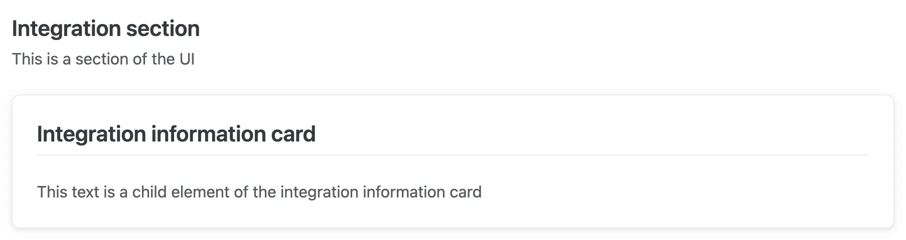 (Preview is of a section containing a card element.) |
addCard() | 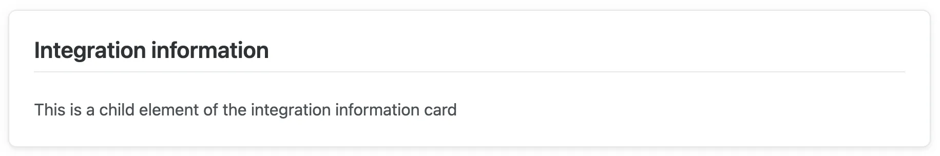 (Preview is of a card containing a text element.) |
addForm() Learn more about the form elements below. | 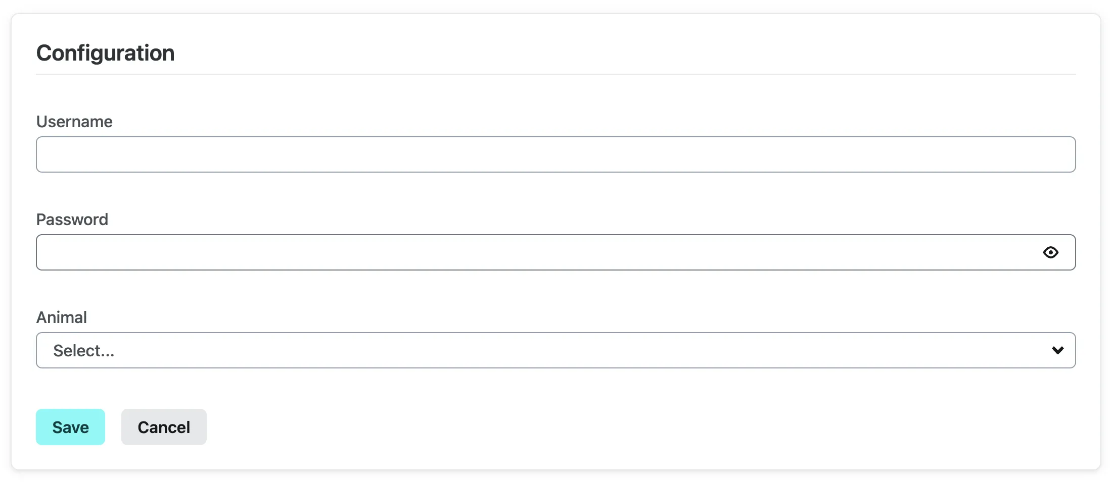 |
Then, render children within the parent element. Using a card as an example, you can render children with the builder method, which is the second property of the addCard function.
route.addCard( { title: "Integration information", id: "integrationInformation", }, // This is the builder method to add children elements (card) => { card.addText({ value: "This is a child element of the integration information card", }); });Form element
The form element is a parent element, as described above. To add inputs to your form, use the following methods:
| Method | Preview |
|---|---|
addInputText() addInputPassword() addInputSelect() | |
The form element itself also includes an onSubmit method. This is where you can reference the UI state and retrieve the form values that are sent on submit.
Here’s an example of a form without an onSubmit method to start with:
route.addForm( { title: "Configuration", id: "configuration-form", }, (card) => { card.addInputText({ id: "username", label: "Username", }); card.addInputPassword({ id: "password", label: "Password", }); card.addInputSelect({ id: "animal", label: "Animal", options: [ { value: "dog", label: "Dog" }, { value: "cat", label: "Cat" }, ], }); });To create an onSubmit method, use the picker object from the state. The picker object contains a method called getFormInputValue() that you can use to retrieve form values from state by passing in the form ID and the field IDs. In the below example, the form ID is configuration-form and the field IDs are username and password.
route.addForm(  {    title: "Configuration",    id: "configuration-form",    onSubmit: (surfaceState) => {      const { picker } = surfaceState;
      const username = picker.getFormInputValue("configuration-form", "username");      const password = picker.getFormInputValue("configuration-form", "password");    },  },  (card) => {    card.addInputPassword({      id: "password",      label: "Password",    });    card.addInputText({      id: "username",      label: "Username",    });  });
You can add validation to any text or password input field by using the validation property. This property takes a pattern and a message. The pattern is a regular expression that will be used to validate the input value. The message is the error message that will be displayed if the input value does not match the pattern. If the input is not valid, a validation error will be displayed to the user when they leave the input field and the user will not be able to submit the form until the input is valid.
route.addForm(  {    title: "Configuration",    id: "configuration-form",    onSubmit: (surfaceState) => {      const { picker } = surfaceState;
      const username = picker.getFormInputValue("configuration-form", "username");      const password = picker.getFormInputValue("configuration-form", "password");    },  },  (card) => {    card.addInputPassword({      id: "password",      label: "Password",      validation: {        pattern: "^(?=.*[a-z])(?=.*[A-Z])(?=.*[0-9])(?=.{8,})",        message:          "Password must be at least 8 characters long and contain at least one uppercase letter, one lowercase letter, and one number",      },    });    card.addInputText({      id: "username",      label: "Username",      validation: {        pattern: "^[a-zA-Z0-9]{3,}$",        message: "Username must be at least 3 characters long and contain only letters and numbers",      },    });  });
You can also use the picker object to set the value of an input field by using the setFormInputValue() method. This is useful for setting default form values when the UI loads. To do this, use the onLoad method on the route.
route.onLoad(async (surfaceState) => {  const { picker } = surfaceState;
  picker.setFormInputValue("configuration-form", "username", "new value");  picker.setFormInputValue("configuration-form", "password", "new value");});
Disable integration section element
The disable integration section element allows users to disable an integration. You can optionally change the integrationName to change how the name of your integration will appear in this section.
| Method | Preview |
|---|---|
addDisableIntegrationSection() | 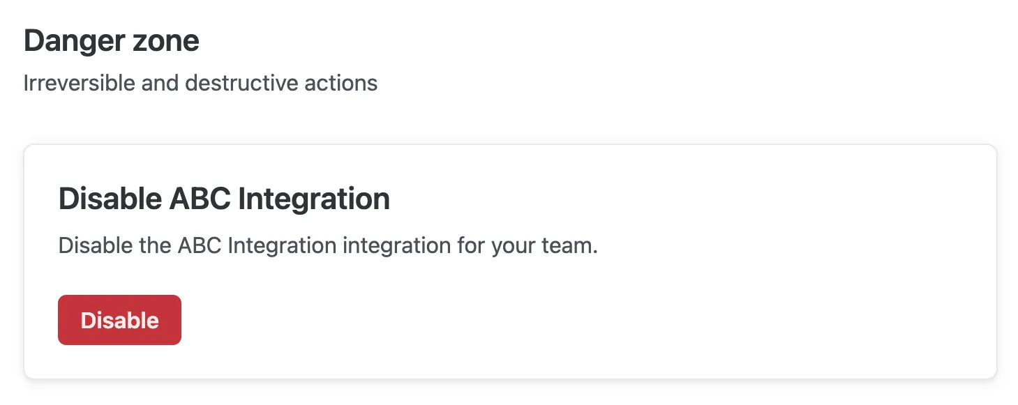 |
route.addDisableIntegrationSection({ integrationName: "ABC Integration",});OAuth card element
Prior configuration required
To use the OAuth card element, you must follow the steps outlined in the OAuth section.
The OAuth card element allows integration users to authenticate with your OAuth identity provider, before any other logic runs.
| Method | Preview |
|---|---|
addOAuthCard() | 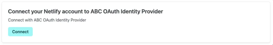 |
route.addOAuthCard({ providerFriendlyName: "ABC OAuth Identity Provider", connectWithMessage: "Connect with ABC OAuth Identity Provider", disconnectFromMessage: "Disconnect from ABC OAuth Identity Provider", disconnectWarning: "Add this property to show a custom warning to users before they disconnect from your OAuth identity provider",});